TACO BELL
KITCHEN APPLIANCES
KITCHEN APPLIANCES
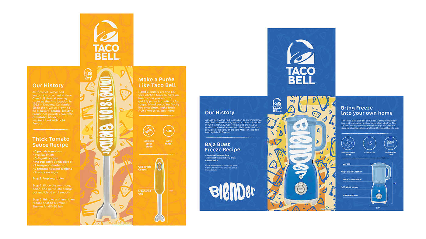
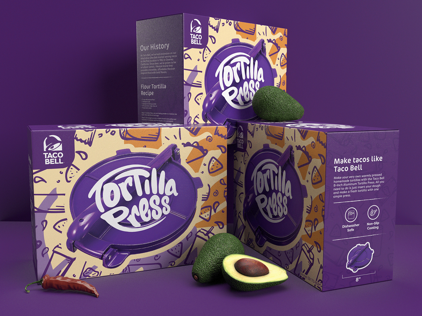
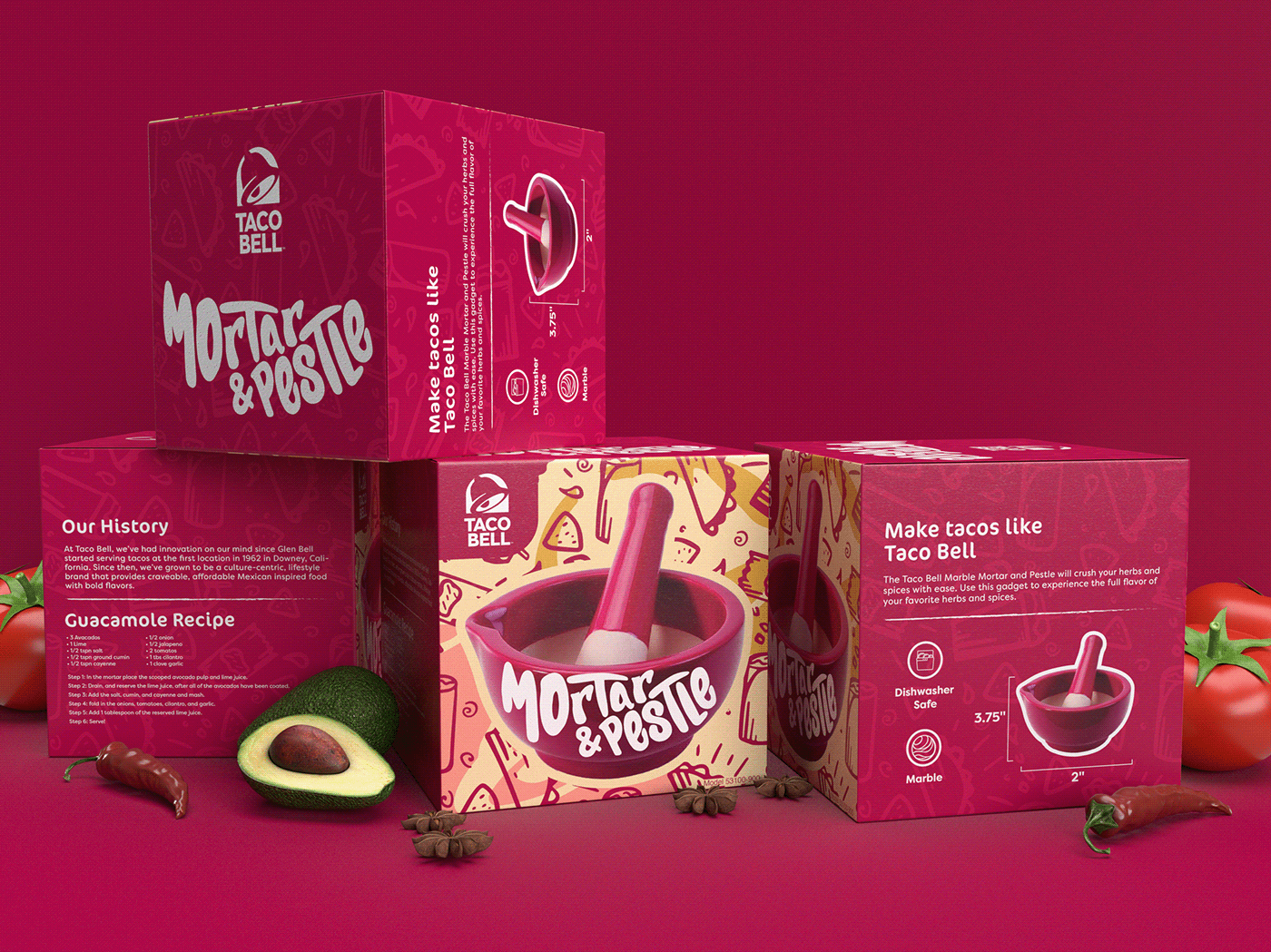
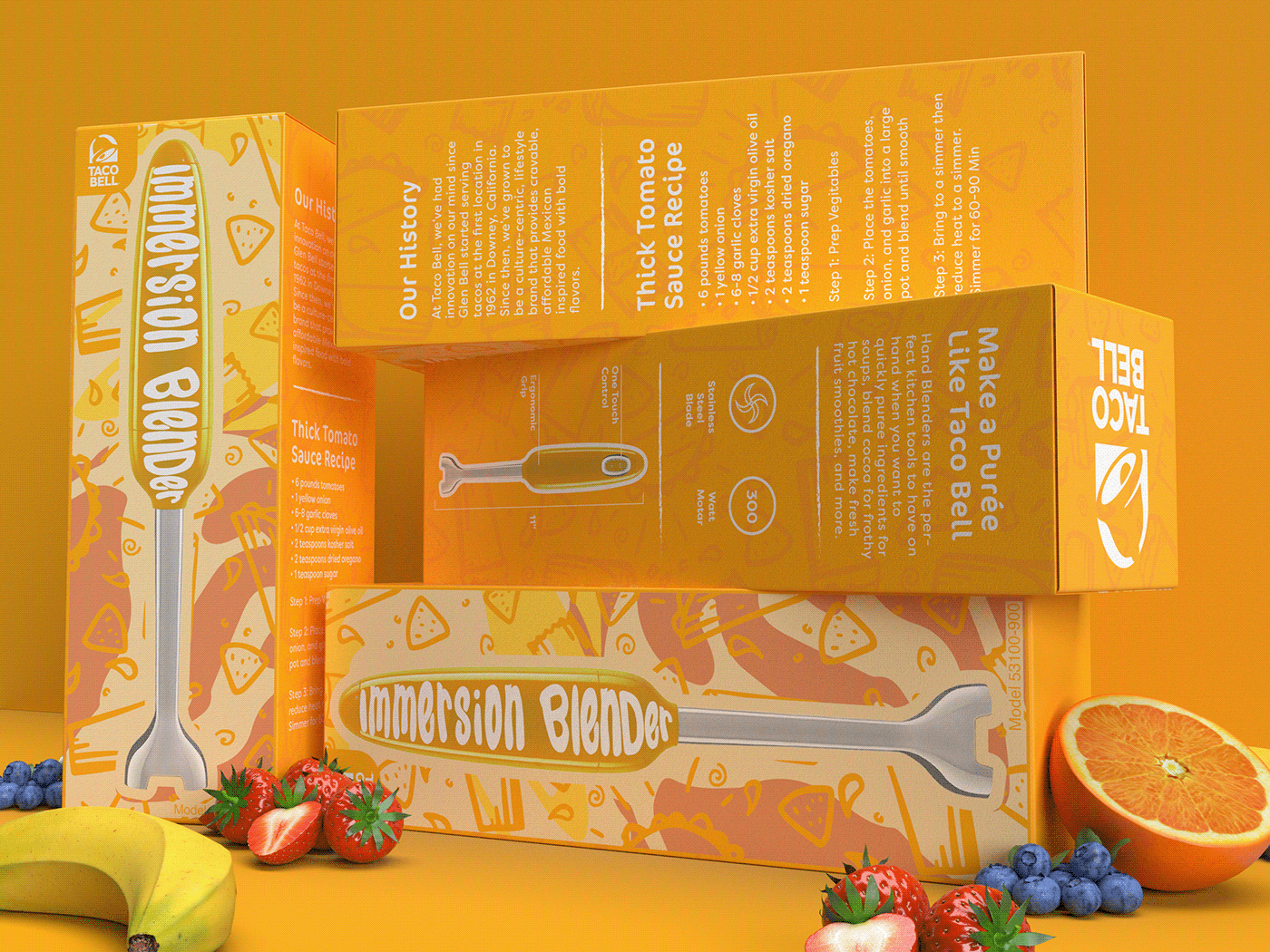
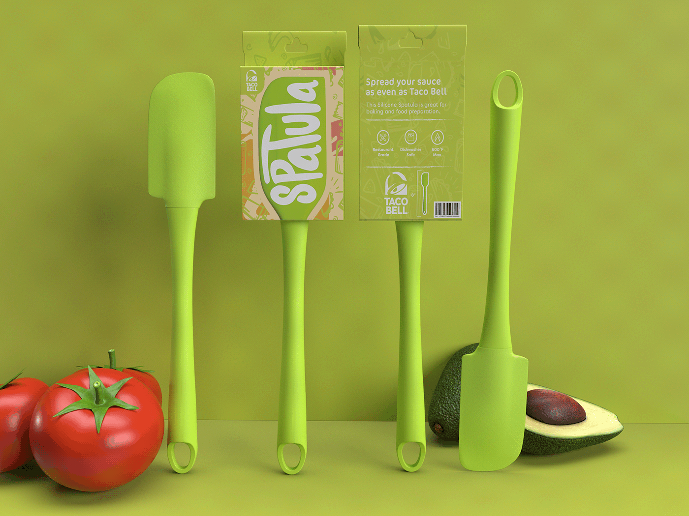
This project asked the students to pick a recognizable brand and create packaging in a market they currently don't exist in. I chose Taco Bell as my brand and decided to enter them into the world of kitchen appliances.
As a fast food chain, Taco Bell stands as one of the more friendly and welcoming brands. They are known to enter markets outside of the fast food market and so I thought the home kitchen world was a welcomed extension.
I played off the enjoyable fun loving color scheme that Taco Bell already uses and created a font from scratch to fit a bubbly and inviting product. I used the product images as a shape to fill with type and made the product and the title the focus of each package. My goal was to create a series of products that aimed to younger individuals with their first kitchen that want to add a splash of fun.


When thinking of how to express the charismatic appearance of Taco Bell’s current branding, I used their own social media presence to inspire the direction I was headed. I made it a goal of mine to capture the youthful nature by personally illustrating each product name on
the product.
the product.
I chose a bubbly, graffiti inspired form that took the shape of the product image bellow it. I made sure to model the text in a way that both filled the shape without obscuring the product image.